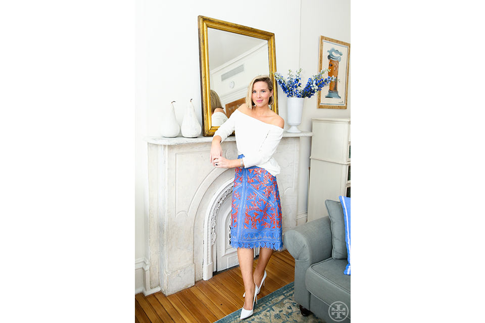
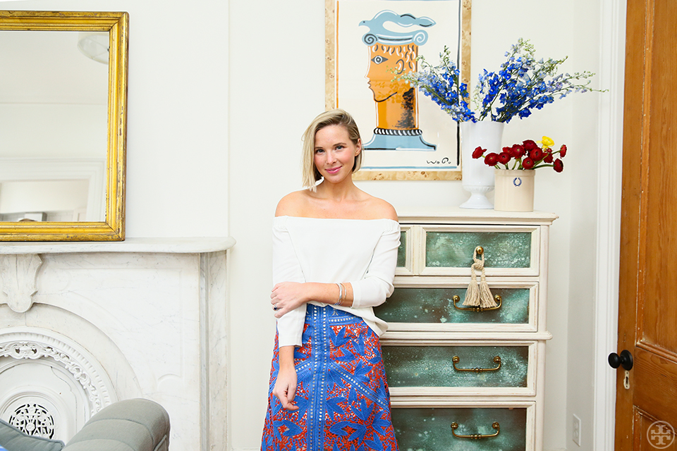
We get some one-on-one time with Interiors Stylist Sarah Storms. Here wearing a skirt from Spring 2016, she discusses childhood design spaces, the power of drapery and Vervoordt vs. Castaing.
My interiors style is…
Rooted in traditionalism, architecture-deferential, print-happy, pro-tassel.
My design influences…
Being exposed to great architects and interior designers in my work life has helped me home in on what I think makes a truly successful home, but I’m lucky enough to have great design teachers in my personal life, as well. My father-in-law, Frank Greenwald, is a deeply talented architect: He designs spaces that are somehow simultaneously serious and airy, that make a statement about quality and beauty without being the least bit unsubtle. I leave stays at my husband’s family home filled with new ideas about how to purify my ideas, distill my inspirations, collect smartly, display innovatively. When I leave my parents’ home, it’s usually with a canvas bagful of my mother’s silver, framed botanical prints, hemstitched table linens — I always unearth some new treasure in her thoughtfully-collected vignettes. That dichotomy between clean-lined austerity and layered classicism informs my feelings on design: it’s all about toeing that line, and I’m grateful to be surrounded by such inspiring arbiters of both.
Favorite interior designers…
Axel Vervoordt for his luxe restraint, Michelle Smith for her fearless dedication to a restricted palette, Madeleine Castaing for her genius with print, and Miles Redd for giving preppy style real design cred.
My childhood bedroom was…
My family moved all over the place during my childhood — from a wavy-floored colonial in Massachusetts to a formal apartment in a European city — but we settled in New Jersey when I was in middle school. My tastes had gone through an evolution even by then (my saintly mother allowed me to dress however I wanted as a young child, which was often in swishy jogging suits paired with drugstore-bought plastic high heels — you can imagine what that kid wanted on her bedroom walls) and by the time we moved to New Jersey, I had wised up to my mom’s take on style. Having watched her transform the wildly different homes we had lived in over my life, I remember thinking she could pretty much read the pulse of any type of space and make it feel not only respected, but aesthetically pushed forward. For this home, a crumbling turn-of-the-century horse farm, that meant period-worthy styles rendered in bold colors and prints. My bedroom got bright blue toile de jouy wallpaper with matching drapery in egg yolk yellow.
And if I could have designed the above myself…
I remember hating that room when I was in college, vowing that the first space of my own would be graphic and sleek, which it was (lacquered Parsons everything, Josef Frank fabrics to the hilt). But today, nearly 20 years after my family moved in, my childhood bedroom feels so right. The paper is a bit peely and the curtains are sun-bleached at the edges — and I wouldn’t change a thing.
Favorite house/room in the entire world…
French florist Thierry Boutemy’s Brussels living room. There’s one corner where an antique love seat of presumably French provenance, piled with blue folky-print pillows, sits under a window that imparts this serene glow on a collection of white ceramic animal figurines lining its sill. The whole scene is flanked by these arching, wood-carved corbels that look almost like wings extending from the chaise. If it sounds like a lot, that’s because it is — but it manages to be so enviably, offhandedly elegant, and looks not the least bit contrived, just comfortable, collected and functional. It’s the most beautiful ode to bohemianism imaginable, and I am entranced by how a space so seemingly organic can be so profoundly sophisticated.
One easy way to make your home look new without a redesign…
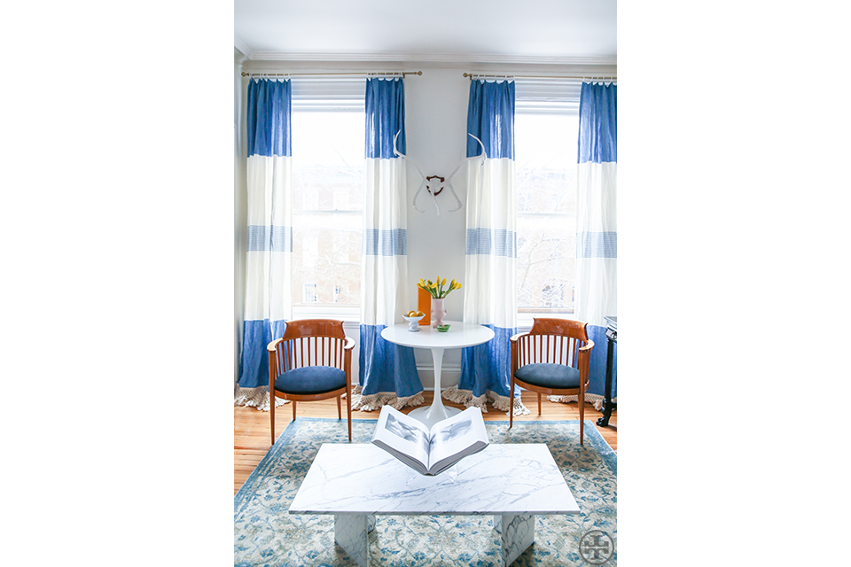
Drapery. It’s the most transformative finishing touch, sets up even a meager view, and, if employed correctly, can make your ceilings look higher than they actually are.
And my pro tip to changing up the decor quickly for a gathering or dinner party…
If you don’t have anything on the walls (and are afraid of the permanence of nailing something into place just for the night), embrace the lean. Arrange framed photos or prints, small canvases or even good-looking books in staggered layers on a mantel or dresser, propped against the wall. You’d be surprised how intentional it can look.
Favorite recent finds for the home…
I’m obsessed with the artist Wayne Pate, he indulges my love of dusty pastels and aquiline classicism, treating serious subjects through a not-too-serious lens. Sydney-based Utopia Goods is making my favorite textiles of the moment; like an outback Manuel Canovas, they make large-scale, color-drenched prints emblazoned with indigenous flowers and animals. While hard goods should be timeless, accessories and decor, I think, need to be unabashedly happy.
My favorite online design resources…
I really do love Etsy, it’s a portal to such talent, like my swear-by-forever linen source, Karen Robinson of K Style Designs. She happily indulged my request for mustard yellow dinner napkins with sage green rolled edges, but her ready-made collection is dreamy, too. Sue Fisher King’s San Francisco shop is a total décor dreamscape, full of Astier de Villatte ceramics in hard-to-find styles, and one of the only stores of its caliber that has an equally comprehensive and beautiful website.


