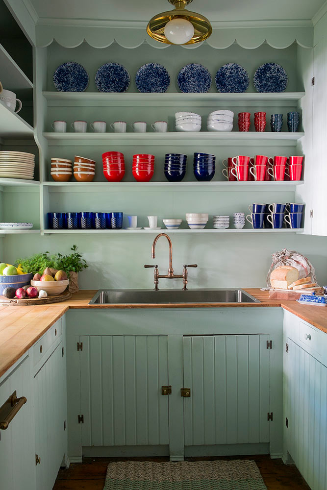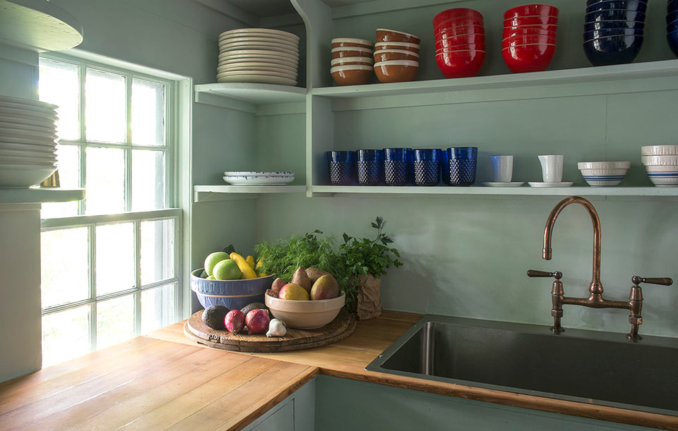
Interior designer Michelle Smith of Studio MRS is known for elegant, European-inspired interiors that blend a studied nod to traditionalism with a hint of the modern and unexpected. She came up under Daniel Romualdez (the man behind Tory’s apartment, home and stores), but has attracted a fashion clientele all her own, including Prabal Gurung and Gabriela Hearst. While idiosyncratic glamour is her modus operandi, the kitchen of her Sag Harbor weekend cottage is anything but fancy — a small space that is equal parts functional, photogenic and chic. Here, she breaks down how to recreate its charm.
Choose a pale color that will reflect light but add interest. I swear by Benjamin Moore’s Palladian Blue, an almost-blue, almost-green seafoam color that looks fresh but is actually considered a historic hue — perfect for this circa-1790 kitchen.
Go deep.
This is a weekend house, so we are usually cooking three meals a day which means three messes a day. I made this stainless steel sink extra deep, so if you choose to relax a minute before you clean, you don’t have to look at a pile of dirty pots and dishes sticking out of it.
Embrace the mix.
It’s important to meld old and new for a kitchen that feels modern but not out of place. Unlacquered copper fixtures are my favorite way to accelerate the “old” part: buy them new, and watch as they quickly patina every time to turn the knob. It’s like creating your own history.
Be open to open shelving.
It forces you to think about what you need and don’t need in your kitchen, and allows so much more light to stream through the space than there would be with bulky upper cabinets. I try to dissuade clients away from uppers whenever I can; they end up as acting like floating junk drawers, full of mismatched and unused glasses and impossible plate stacks. With exposed shelves (plenty of them, mind you), you’ll edit down to what you really need—and you’ll remember to use the pieces that would have otherwise been buried, because they’ll be right in front of your face.
Think about a palette.
When painting rooms, I tend to go for non-color colors, like beige, tan, washed-out pink, barely-there blue, so the real introduction of color comes in the form of accessories. The kitchen is no exception. It’s the first thing you see when you wake up, so it should make you happy…so against that dusty, pale wall color, I introduced cheery blue, red, and white for my tableware: it serves the function that art or accents would in a living room.
Invest in the classics.
Stocking your kitchen is more important than it gets credit for. You use your cutlery, glasses, and plates more than you use almost anything else in your house — invest in them, and make sure you use them like crazy.
But not everything has to break the bank.
A few of my go-tos for dinnerware, napkins, and other goodies: Zara Home (colorful but simple dishes), Wayfair (wine glasses), Ikea (hand towels, chipping boards, even food containers) and Etsy (terra cotta bowls and serving dishes).

