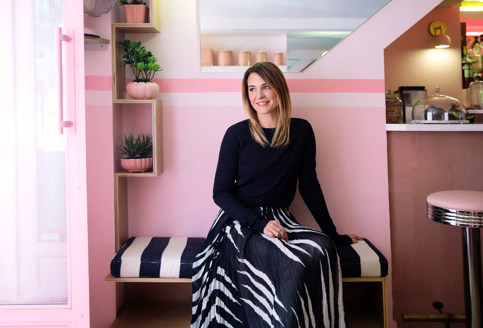
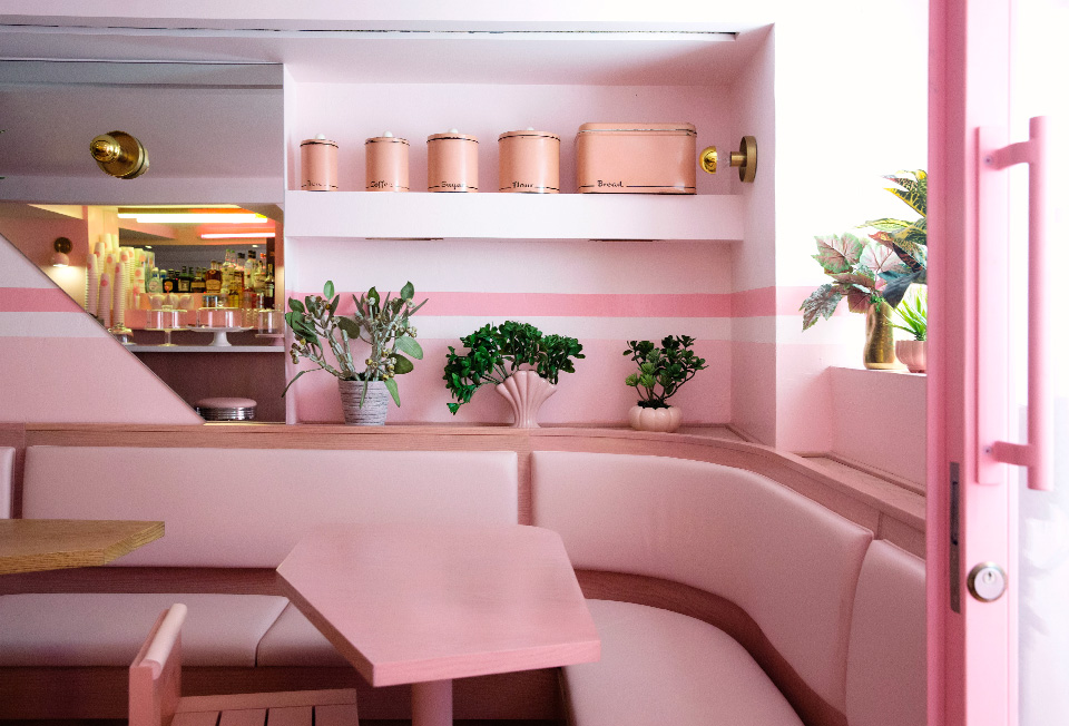
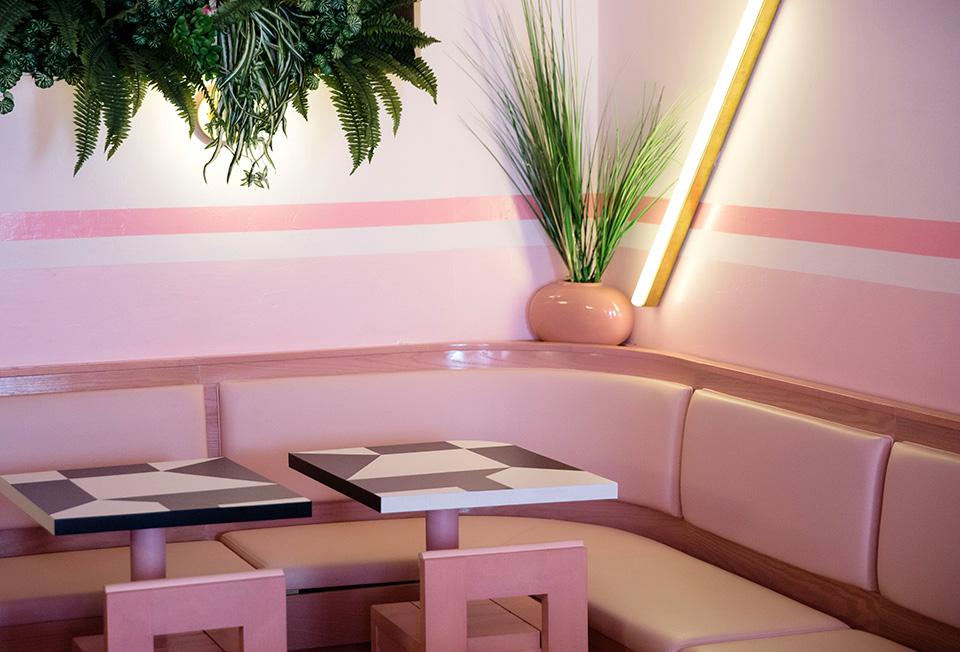
We interview interior designer Jeanette Dalrot, who recently worked on New York’s all-pink eatery, Pietro Nolita. Above, she wears Tory’s Lucea maxi skirt.
I’ve been interested in creating things since I was a little girl, starting with building weird stuff in my dad’s garage and sewing my own clothes from old sheets to entering fashion and photography schools in my teens. I only found my real calling when I went to art school, however. I started experimenting more and more with art installations and sculptural elements, which led me to Konstfack (one of Eurrope’s most prestigious art universities), where I received a fine arts degree in interior architecture and furniture design. I have always been a big fan of dining out, and even though Sweden doesn’t have a big tradition of going out often (usually you go out to eat a few times a month, a bit more in the bigger cities), I have always been one to spend more evenings out than at home, which earned me a lot of friends in the hospitality industry. I started designing restaurants after just a year into my university training. When I graduated I already had a full-on business with demand, designing high profile restaurants in Stockholm.
Why I gravitate to restaurant design…
Restaurants are my favorite environments to exist in — so much more than just places where you eat, they’re a break from the ordinary. Great interior design can do that, not just for the people who run a restaurant, but for the countless people who visit it. I also like learning how my spaces will be used — it’s gratifying to see how the furniture and design details are actually perceived and used in reality by the guests and staff. It’s always a learning curve, and it gives me ideas for how to improve my next design.
My design inspirations…
Serge Becker was on the top of my list of creatives I dreamed of working for when I moved to New York from Sweden, and luckily I got to do that. His approach to design and operational concept is inspiring and I always find myself thinking: “What would Serge do?” Fashion designer Ann-Sofie Back, a former client who will always say what’s on her mind and create what she urges to create, and always has had the ability to push concepts to its furthest limit. Designer Ilse Crawford for her beautiful hospitality interiors that always have the perfect color and material combinations. True eye candy.
The Memphis Group. Their designs were fun and playful, and they pushed the emotional buttons rather than the rational ones, which is perfect for this space. They were the masters of using the color pink in a way that wasn’t soft, juvenile or granny romantic; it was bold and awesome. But after finding that main creative direction you still have to find the rational inspirations. This is a small space and you have to be smart about the details — it’s really all about function.
The restaurant’s design in three words…
Bubbly, breezy and bold.
My use of the color pink — and whether it’s in or out of my usual comfort zone…
I never wear pink — nothing against the color, I just like the “blank canvas” of wearing all black. It enables me to go crazier with the shapes and textures. I guess I am a bit more architectural than graphic. When it comes to restaurant design, I think about it the other way around. I like creating spaces with signature colors, textures and patterns, preferably in a mix. I usually try to have two to four colors that will be the signature “foundation” for a certain space, and then mix in any number of finishes or textiles to keep everything cohesive but interesting.
My all-time favorite restaurant design in New York…
For effortless design I would say Forgtmenot because it has my favorite hang-out spot since I moved here, and sometimes it’s as simple as that. The style is not forced; it is exactly what a place like that should be: a blend of someone’s favorite pretty things, great food and great guests. Best “real” New York vibe: Red Rooster, Harlem. Great place, great vibe, great colors and lighting and the atmosphere feels very accessible to all types of people. Of all the (hundreds) of rustic/industrial/classic/distressed style Brooklyn restaurants, I think Hotel Delmano is the most beautiful — it feels like a bit of a time travel, and that ceiling is so great.


