When it comes to upgrading an invitation to a work of art, we’ve already shared our love for personalized painterly touches here. But don’t forget that packaging matters, too. After all, first impressions count and, for invitations and letters, the envelope makes the first impression.
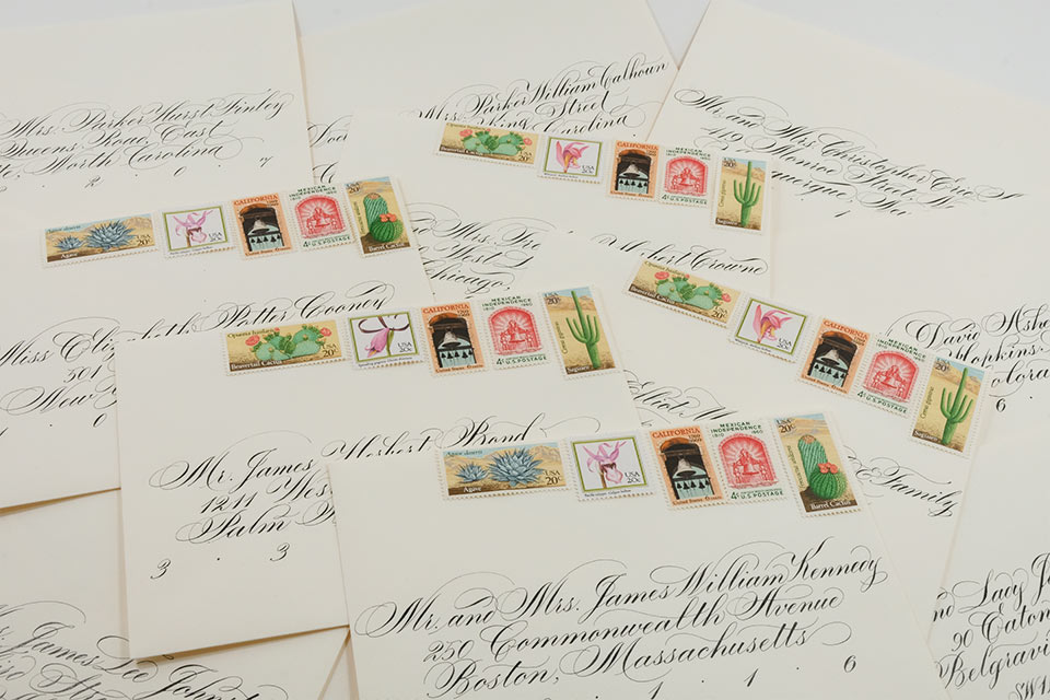
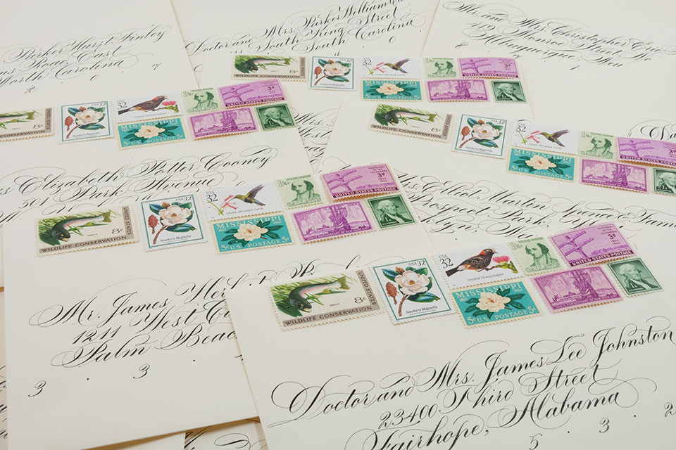
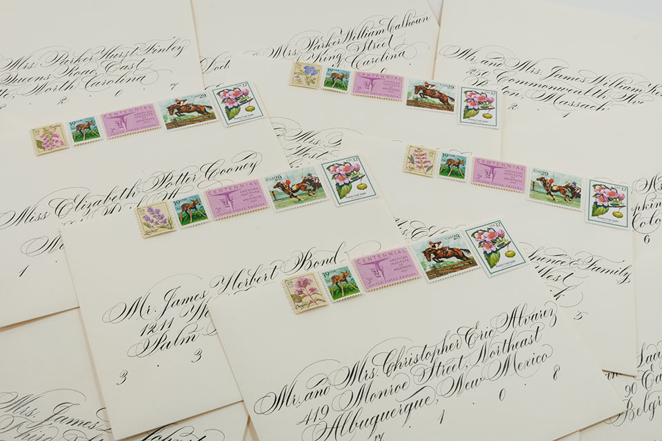
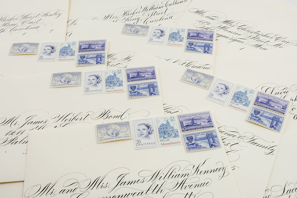
Which is why we’re excited to introduce Magnolia Postage’s Vashti Davies, who specializes in beautifully curated postage. Check out her work, which features vintage stamps, in the slideshow above and learn how she stumbled on this niche career in our interview with Davies below.
The inspiration behind Magnolia Postage…
When I was in the process of planning my wedding I had run across a few images of vintage postage used on wedding invitations and thought it was a gorgeous way to convey the theme and feel of our event. My thinking was: If we’re going to pay a lot for calligraphy to dress up the envelope, why stop short when you have the option to include an extra personal touch? We did custom envelopes for each of our guests based on our relationship with them, their background, interests, location, etc., and when all was said and done I had a huge stamp surplus (which has since continued to grow at an alarming rate). I had so much fun doing ours, and got so much positive feedback from guests about how touched they were by the gesture (one of our guests framed their envelope), that I decided it would be a fun business to start up.
My stamp fascination comes from…
I’m guessing the original discovery was a Pinterest find #pinterestproblems… but I would say that I am not your standard “stamp collector,” though I have certainly come to appreciate the incredible amount of detail that artists have managed to fit into a square of paper. Philatelic history is actually incredibly fascinating once you dive in. All of the stamps we use are U.S. vintage stamps that have been released by the U.S. Postal Service over time, and then lovingly collected, cared for and re-sold by stamp collectors (who are, by the way, incredibly nice and interesting people).
Generally speaking, I just think it’s neat to include a limited piece of history for special invitations and greetings — we regularly use stamps from the Thirties, Forties and Fifties, and we are looking forward to putting together vintage Christmas and holiday card sets like we did last year. Paper is back in a big way.
When I say “curated postage,” I mean…
We regularly work with clients to help them put together a set of vintage stamps that complements either a general theme, location, color scheme or set of interests (botanicals, blues, greens, pinks, cities, etc.). We are obviously limited by what the U.S. Postal Service has released over the years, something we regularly have to remind clients — “No, there aren’t university stamps (for the most part) or stamps featuring many international cities” — and also by the fact that you need a certain amount of postage on an envelope for it to be mailed, so it’s a constant puzzle working to get the right amount of postage on an envelope that looks good combined, and also gets the envelope through the mail.
The most memorable request received…
I’d say that most of our jobs are pretty tame — we’ve done a TON of wedding suites, standard correspondence sets, lots of Christmas and holiday cards, as well as some gorgeous baby announcements.
We’re currently working with a bride to do a set of Mexico-themed postage for an elopement later this year and we are prominently featuring a stamp that is widely considered by some to be the USPS’ biggest failure as some people find it borderline offensive: “Alcoholism – You can beat it.” Obviously you need to know your audience, but in fairness, USPS released the stamp.
And my favorite stamp ever…
I would be lying if I said that was an easy question to answer — there are some really gorgeous stamps out there (it might sound cheesy, but whatever, there are). I have two favorites from the same set of four eight-cent stamps that were released in 1971 to raise awareness around Wildlife Conservation. My two favorites feature an alligator, and the other a rainbow trout. The colors are incredibly rich in person, and the design is ridiculously detailed when you consider that the stamp is less than two inches wide.


