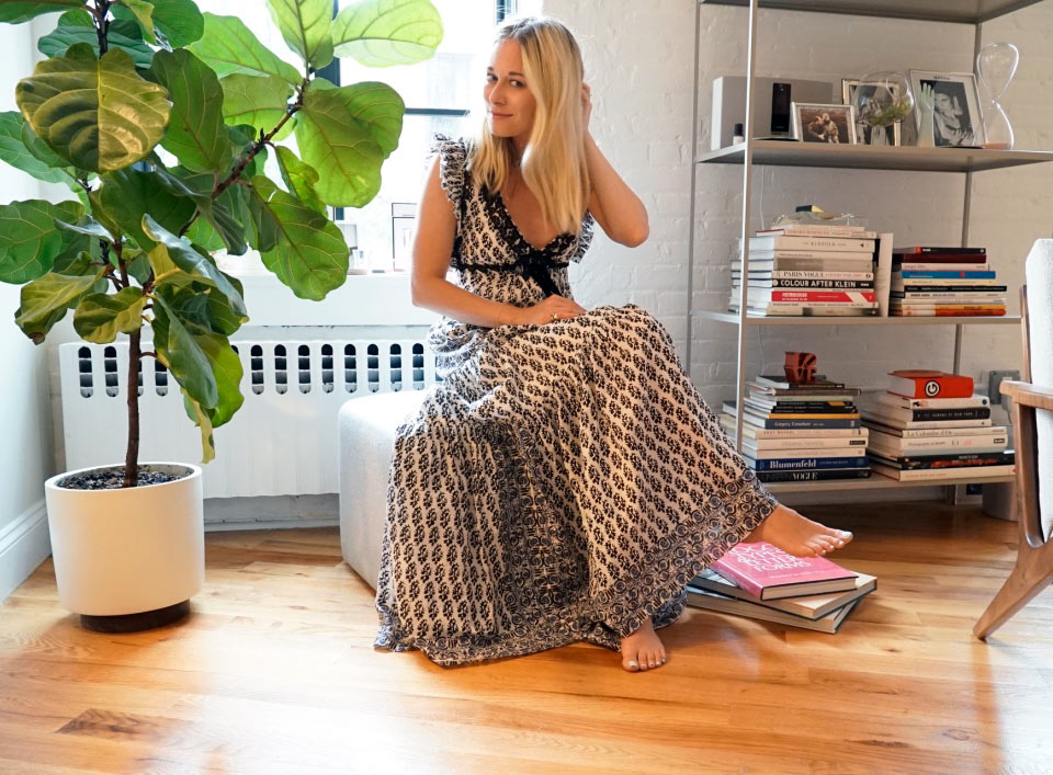
You know the phrase “the whole is greater than the sum of its parts?” It applies to books too, as anyone who beams with pride at his or her carefully curated collection can attest. Here, we talk with one such person: Creative director Alexandra St-Amour, who opens up about the inspiring reads she can’t live without, plus her secret to a beautiful book display.
The first book I wanted to keep…
I would say it was Logotypes & Letterforms. I remember seeing a talk in my first year of art college on logo design by a very established type designer from the agency Pentagram, which I held very highly as the holy grail of design firms. At the end of the talk, the book that had a lot of the work being referenced was on sale. It was expensive for a first-year design student and definitely a luxury I had to very carefully consider before buying. After a bit of deliberation I felt confident, though, that I wanted to take it home with me that night. This turned out to be a great decision as I have referenced it many times throughout my career, including the years when I started researching on logos and branding.
Authors or genres I collect…
I have three Guy Bourdin books. I adore his photography and feel inspired by it every time I revisit. I can’t count the amount of times I’ve had his imagery in my head when art directing a shoot for shoes or accessories, in particular. I have an exhibition poster of his hanging in my office. I love Donna Tartt, especially The Secret History — I devoured that book over a weekend on holiday in France and wonder why someone hasn’t made it into a movie yet. The Goldfinch, of course, is another brilliant story, which was such an exciting and exhilarating trip to read.

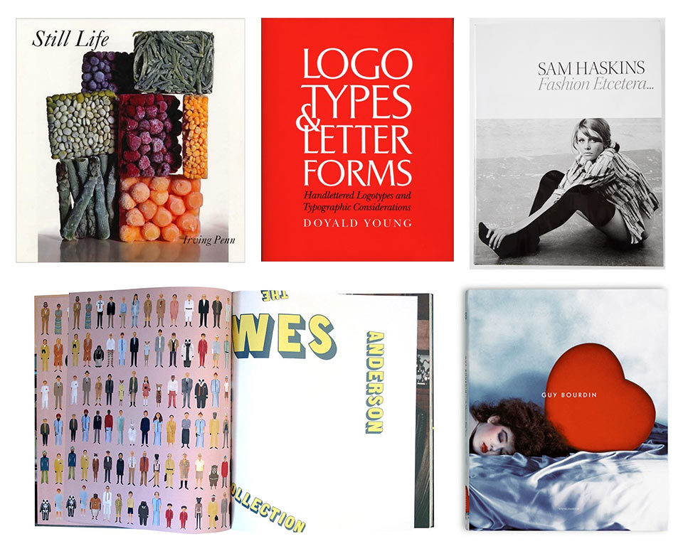
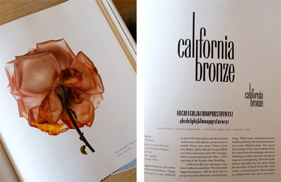
1. Still Life by Irving Penn — the most original and unique take on still-life photography focusing on food. Even though the subject matter is not something I work with, there is so much inspiration, from the compositions and the inspired set-ups to the approach Penn took to his work.
2. Logotypes & Letterforms – an exhaustive and beautifully curated study of some of the best and most creative logos and typography approaches to branding over the last 50 years. I reference it whenever starting a project that requires new logos and/or typography.
3. Fashion Etcetera by Sam Haskins — a beautiful, large-format coffee-table book primarily focusing on Haskin’s fashion photography from the Sixties, including the iconic Five Girls photographs. It is a thematic slice through his archive that explores a lifelong passion for fashion, style and design.
4. The Wes Anderson Collection. Wes Anderson’s films have always been my absolute favorite, the obsession beginning early on when Mum took me to see Rushmore at the Chinese Theatre in Hollywood at age 13. The attention to detail in his movies is so precise and inspired, and this book documents every single decision made from an artistic and cinematic direction perspective. Each page is filled with conversations, photographs and artwork surrounding his films. It brilliantly showcases Anderson’s pop-culture inspirations, from Hitchcock and Star Wars to Jacques Cousteau and the French New Wave.
5. Guy Bourdin: A Message For You. This book consists of his photographs from the late Seventies, which was widely considered to be his most inspired period. It includes Bourdin’s famous campaigns for Charles Jourdan and iconic French Vogue editorials. The humor and tongue-in-cheek references that appear throughout are utterly timeless and make the images feel consistently modern. I reference them regularly when art directing.

It’s hard to choose just one as all have different and equally important meanings; however, there are two that stand out. One is The Life Adjustment Center photography book by Ryan McGinley. It was an early book of his that Leon, my husband, bought me as an unexpected gift when we were in Berlin together early on in our relationship. I love Ryan’s work and the book is linked with that trip and its memories. The other is Peter Saville: Estate 1-127. Peter is a well renowned graphic designer and artist, and a close family friend and sort of honorary godfather to me. It references album-cover artwork he collaborated on with my mother in the Eighties for the band Joy Division. He gave me this book of his work to date before it was published, with a personal handwritten message in the front.
I organize my book displays by…
Size is how I start. I like to have a nice gradation from large to small in horizontal piles. I then mix up the height of the piles next to each other to make an interesting variation of display. I like to keep them straight — if one is out of place I’ll always catch it and realign! I have a few interesting little ornaments sitting on top of the piles too.
