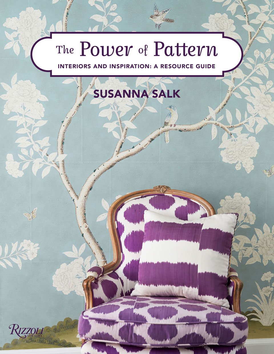
Interiors author Susanna Salk’s latest book has its inspiration in a rather curious place: Sherlock Holmes, the Benedict Cumberbatch edition. “Over the course of one scene in Sherlock’s apartment at 221B Baker Street,” she writes in the introduction, “he began to be upstaged. I froze my screen to ponder Zoffany’s moody and gorgeous fleur-de-lis wallpaper across one wall in his living room…” Salk rang up her editor and the result of their conversation is Rizzoli’s The Power of Pattern, a guide to the breadth of printed possibilities within a living space — from toiles and ikats to stripes and Chinoiserie. Here, Salk opens up about her favorite spaces and shares decor tips for the pattern adverse.
My favorite type of pattern…
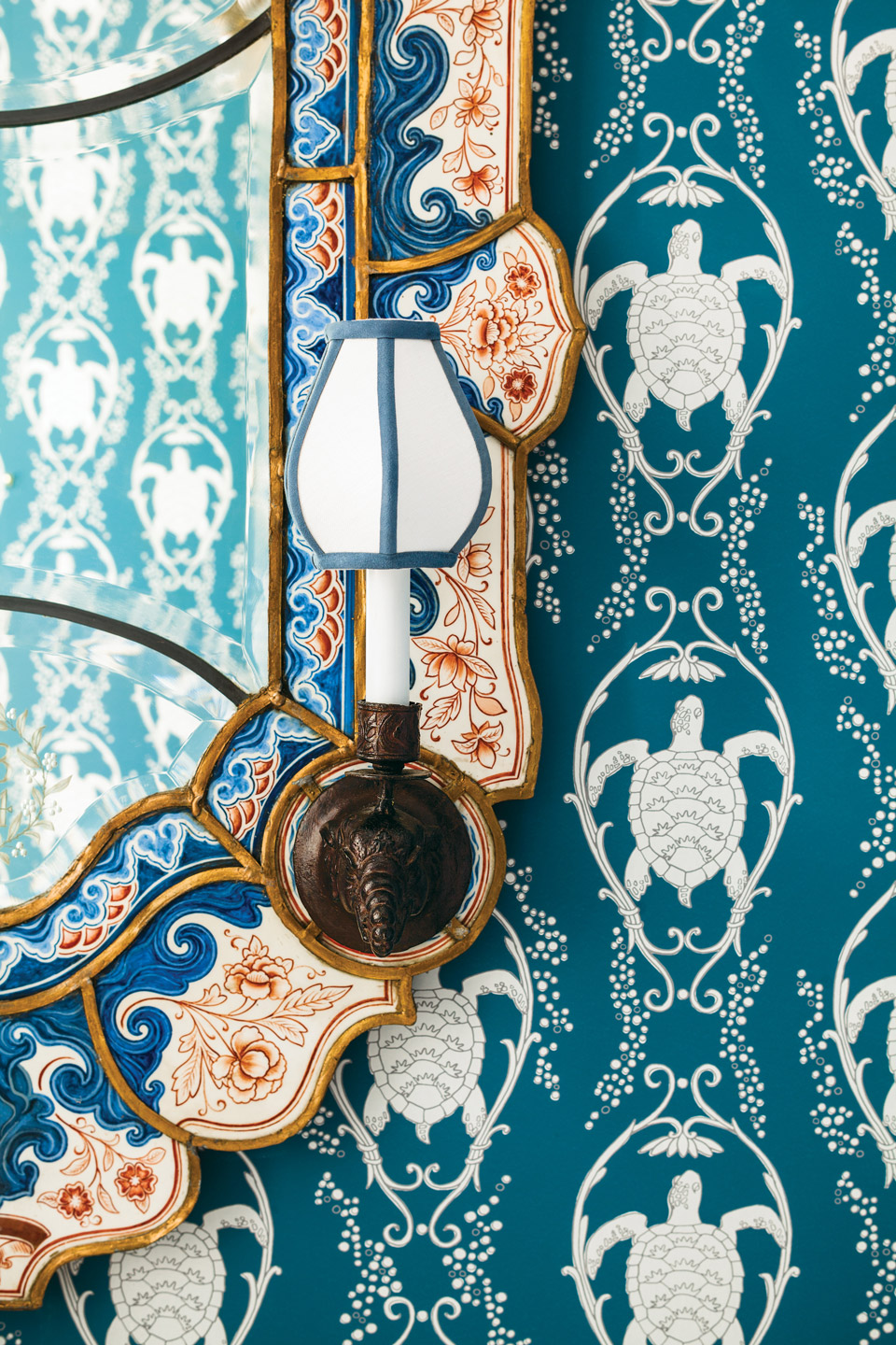
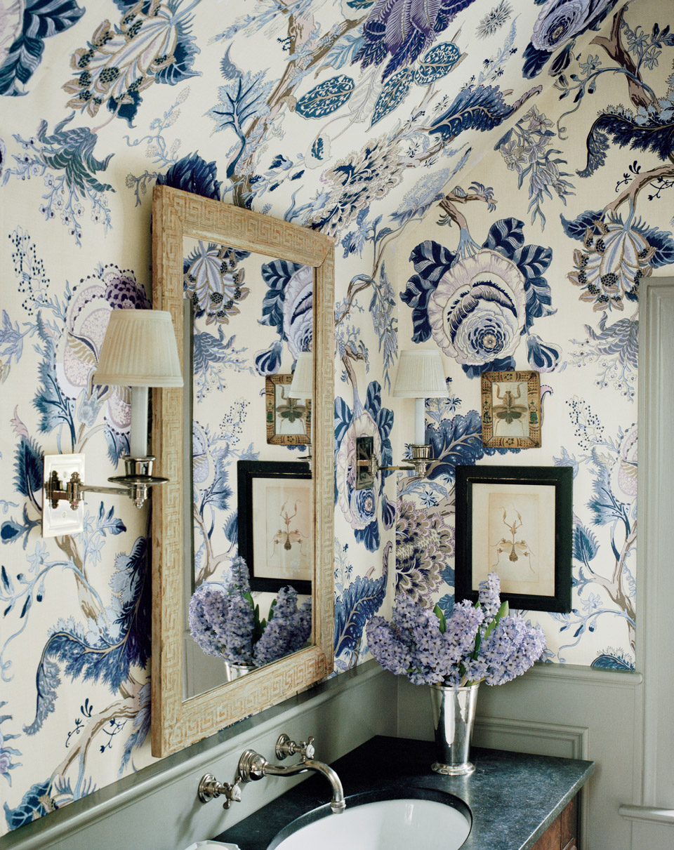
I always respond to nature-centric patterns: flowers, trees, birds, butterflies, shells, clouds. The rendering can be literal or fanciful, but nature’s presence in a room always makes it feel more warm and welcoming because of its familiarity.
And favorite color combinations…
Fromental’s Paradiso in Fern is an insanely chic mix of yellow gold, plums, fern greens, violets and grays. It would make any room feel richer and yummier. And I wouldn’t mind a coat in it as well!
Favorite room in the book…
The way that designers Roman and Williams “grew” a tree across an entire back wall on hand-painted silk makes the more somber furniture in the room feel moody and playful (pages 72 and 73). Pattern here is a country breeze blowing through an urban oasis.
My favorite fictional room (excluding Sherlock)…
Margot Tenenbaum’s room in The Royal Tenenbaums. Nothing is better than eccentric WASP style: it’s got that self-assured pedigree mixed in with just the right amount of quirk to make you want to move right in.
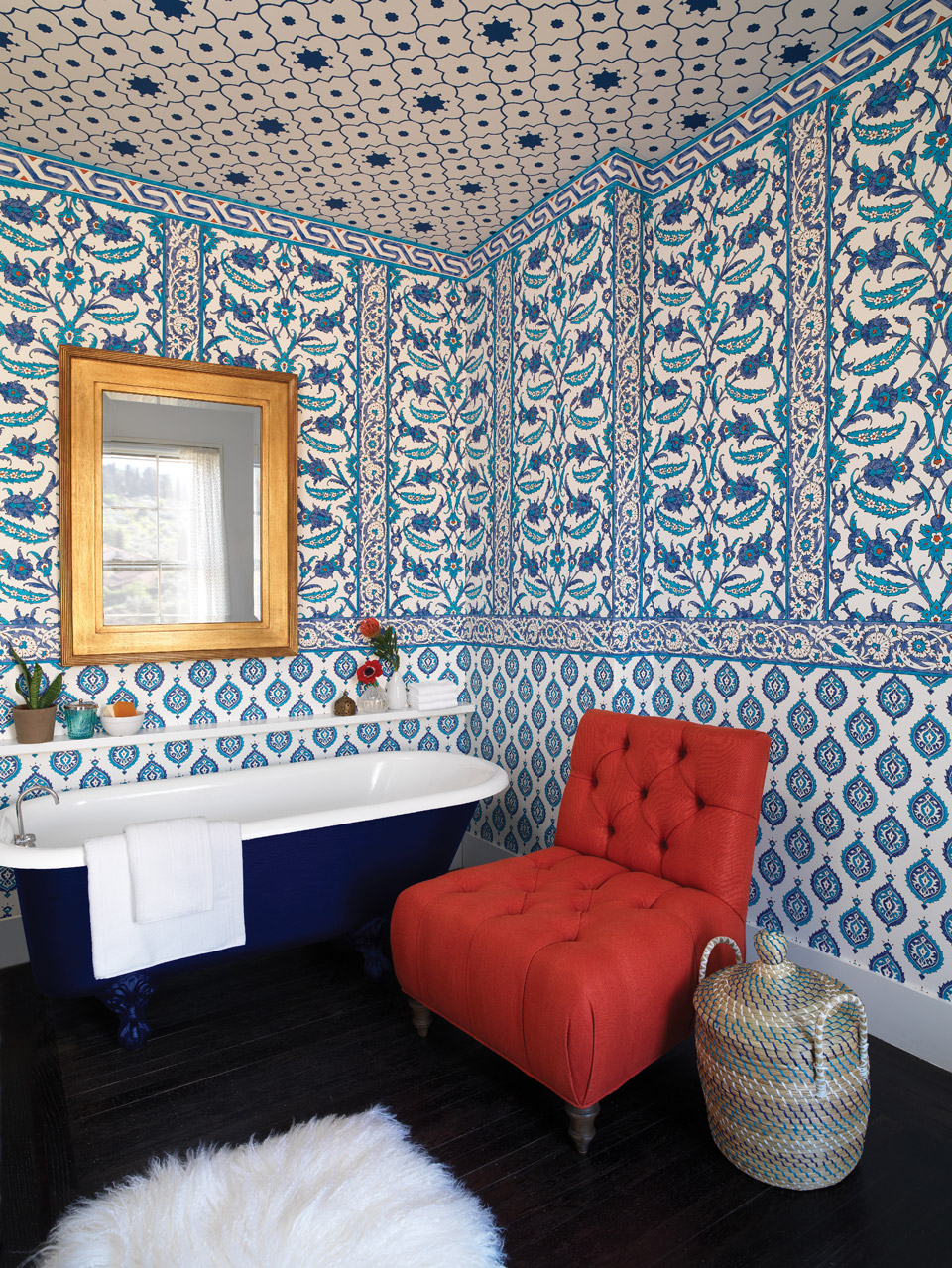
1. Like a good dinner-party seating arrangement, make sure your guests complement one another: a bold pattern should be “seated” next to a more demure one so the dialogue has smooth variety.
2. Try using three patterns with different scales and weave in a neutral along the way to ground it.
3. Rely and take cues from images that inspire you! It doesn’t mean you have to replicate exactly what’s in that designer’s room, but piggyback on a professional’s confidence (and sometimes fearlessness) to remind yourself what can be done and how.
And pro advice to the pattern adverse…
Start small! Try wallpapering your closet or just the wall behind your bed, or even just adding some throw pillows in a favorite pattern you’ve always wanted to try. The key is to love the pattern. If it makes your heart dance every time you see it, then there are no mistakes!